How well considered is your logo?
Cast your mind back to when you first created your logo. Can you remember the process you went through that led you to choose the final design?
If you’ve been reading my articles for a while, you will know that your brand is more than just your logo, but this is very often where it all begins.
Research and understanding
Well, that’s not quite true! Whilst the logo might be the first visual to your brand identity, there should be a considerable amount of research beforehand. Any designer worth their salt should be curious about your business. They should be nosey! Asking lots and lots of questions to get a deep understanding about the essence of your business and what’s important to you; your values, the types of customers you wish to attract and the value you provide through your products and services.
The research and understanding phase for brand design is crucial to give your designer a good understanding of the personality of your business as well as a clear design brief before the designer gets to sharpen their pencils.
Creative concepts
Let me give you an example. Having visited the site of Tadworth Tyres and spoken at length to Duncan, the Managing Director, I was able to really get under the skin of the business.
This allowed me to go away, reflect on the research, and use my creativity to translate what I had discovered into a selection of graphic ideas to represent the brand’s personality.
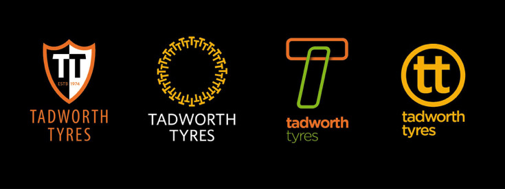
So the next time Duncan and I met, I was able to show him these four very different concepts and discuss which idea would most closely match the brand.
• The first design with the shield and EST: 1974 reflects the heritage of Tadworth Tyres: they’ve been around since 1974 and we discussed how important this aspect of the brand is to the business and for their customers.
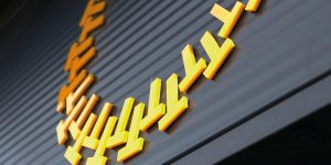
• The second idea is a play on the initials of the business and the tread of the tyre. I didn’t want to deliver a clichéd design showing a literal representation of a tyre but I thought this was subtle.
• The third concept is in a more modern style, loosely representing a racing track, and this stimulated discussion about how we could position the brand away from the traditional tyre service image.
• The fourth, again a play on the initials, is exploring the opposite end of the spectrum to the first, ‘established’ concept with a modern feel.
After considering the range of ideas, the second concept was felt to fit the brand perfectly.
Design development
My next task was to spend time carefully crafting the idea into a finished design: making sure the colours were exactly right, the typography elegantly balanced and that we had enough versions of the logo to allow for use on signs, website, clothing and other applications.
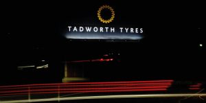
It’s really important to spend time at this stage to ensure the logo will work as well on a website at thumbnail size as it will at supersize on the side of a building.
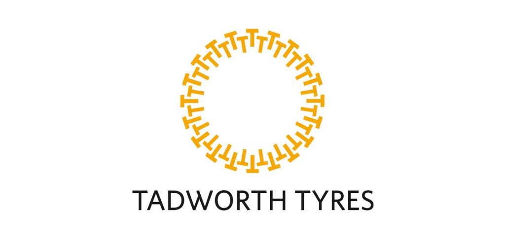
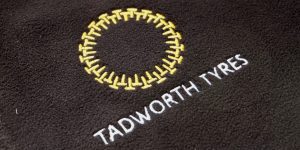
Here’s the final, fully developed logo design:
As you reflect on the process you went through when your logo was designed, I sincerely hope you had meaningful choices that weren’t just variations on a theme and that your final logo was beautifully crafted.
Brand Implementation
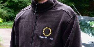
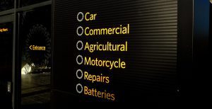
Once the design of the logo design has been finalised and signed off (some testing may be necessary at this stage), the next job is the implementation across all touch points that a prospect or customer has with the business.
Successful branding design is not about simply applying your logo to all communications material, signage, uniforms etc. It’s about carefully crafting everything with a consistent design style that repeatedly communicates your brand personality and engages with your customers.
Everything sings the same tune, in tune.
This is what Duncan has to say about his experience of the branding process:
“Getting proper branding after being in business for forty years without, was a big deal for us. We couldn’t afford to get it wrong. Nick took time to understand what we are about and delivered a range of design options which all hit the spot in one way or another. With his help we chose the right one and it’s made a real difference to how staff and customers perceive the business now. Much more professional, and now we get noticed and remembered when people drive past!”
Duncan Hamilton, MD Tadworth Tyres.
With every brand I help create for a client, we are aiming to achieve a world where every aspect of their branding is something they are proud of.
Next time you see your logo, think to yourself, are you proud of your logo?
If not, maybe we should talk. Please do get in touch. You can call me on 07876 293885 or email me.


Stuart Kerslake
Yay, I was right 🙂
Great work, as ever, Nick the logo/brand looks fabulous in the roll-out usage.