

Repositioning and Rebranding of the Bourne Club
When Martin Browne became President of the Bourne Club in Farnham, Surrey, he was on a mission to increase the membership of the Club. To do this he knew they needed to reposition and rebrand the club to bring it up to date. The brand’s image needed to change in order to appeal to a younger and wider audience.
Time for a refreshed more relevant brand image
Martin assembled a committee of members to manage the rebrand work. I was invited to meet and guide them through the process. We started with an appraisal of the Club’s values and personality and went on to define exactly what the Club offers its members. From this in-depth review, I was able to create a logo and branding style and implement the new branding across signage and other marketing materials.
Personality and values
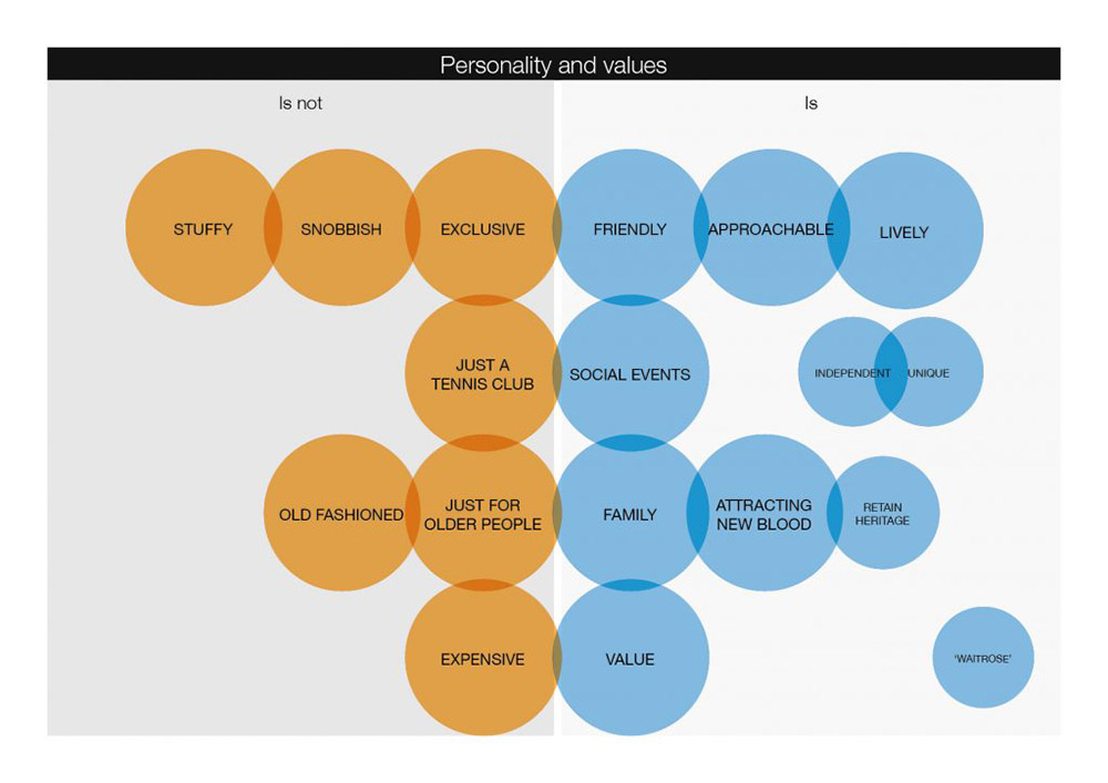
Together we took a long hard look at the current personality of the club and described the more positive qualities they wished to be associated with. This thinking was mapped out in a diagram which represents a ‘re-positioning’ of the brand from where they are today to where they wish to be tomorrow.
When looking at the values and personality of any organisation, it can be useful to note the negative values i.e. those that you definitely don’t wish to be associated with as well as the positive traits.
You can see how this was developed for the Bourne Club in the diagram below.
Defining the offer
With any brand, a verbal description of what the brand offers is crucial to its successful communication.
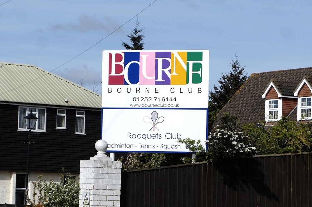
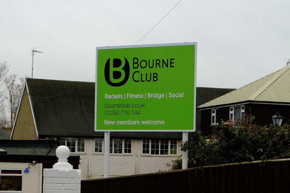
The Bourne Club is not just a tennis club. It has much to offer its members. However, passers-by could assume that it was just a badminton, tennis and squash club, which you can see in the original signboard below.

The activities that members can enjoy are much more than merely racquet sports. The club has a gym. Members can drop in to relax in the lounge and enjoy a coffee and a chat. Bridge nights are very popular and there are regular social activities such as dances, comedy nights and gin tastings.
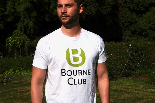
I recommended the strap line, ‘Rackets, Fitness, Bridge, Social’ which sums up concisely what the club offers today. This was agreed upon before the logo design work started. However, to demonstrate how the strap line could be incorporated, I created a simple logo represented by a triangle with the words underneath.
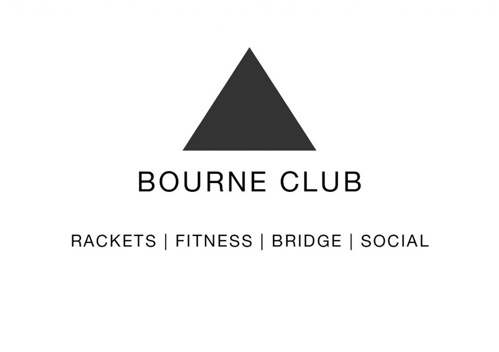
Adding these four words was a significant change to the club’s original profile and broadens the offer from ‘just a tennis club’.
A modern image
To appeal to a younger audience, a contemporary look and feel was necessary.
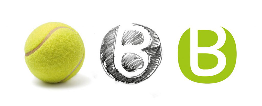
The old multi-coloured logo is replaced with bold, legible lettering and vibrant green brand colour. The chosen logo acknowledges the origins as a tennis club, with a clever use of the letter B.
While looking carefully at the curved line on a tennis ball, at a certain angle I saw the curve form a hint of the letter ‘B’. And that was the inspiration for the logo!
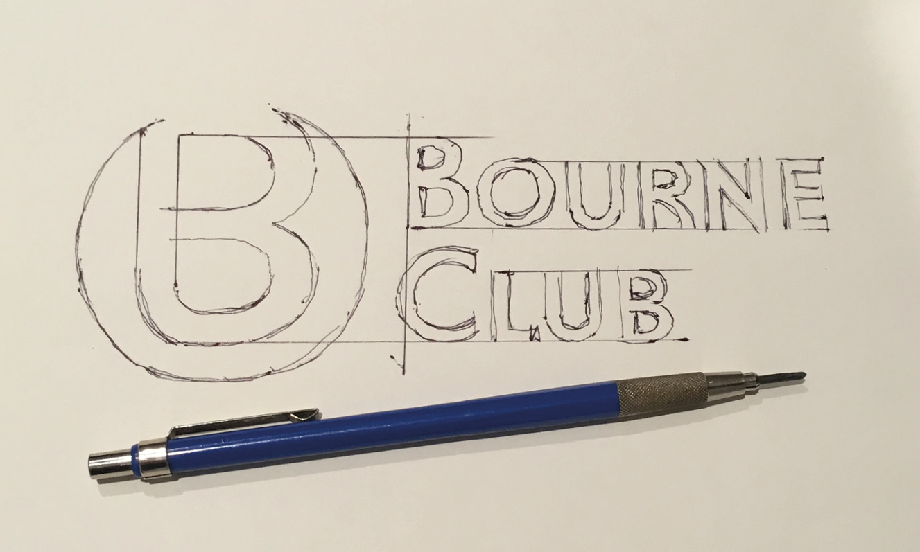
After much refinement, experimentation, crafting and testing, the final developed logo was signed off by the committee and the Bourne Club now has a suite of logo versions; centred, horizontal and stacked, suitable for a wide variety of applications across digital, print and signage.
![]()
The Bourne Club is delighted with its new branding, which was launched in 2017 and continues to be implemented.
This is what Martin has to say about his results of the rebrand:
“Nick came up with a design that reflects the Club’s character as lively, inclusive and contemporary. The branding is very flexible and works brilliantly on signage, merchandise and digital marketing. The reaction from members has been enthusiastic and it has helped to promote the Club to the wider community”
Martin Browne President – Bourne Club
See more of Bourne Club brand design here
Bounce into the 21st Century
If you feel your brand no longer reflects your business as it is today, maybe we should talk.
Please do get in touch. You can call me on 07876 293885 or email me.